Carry1st
Streamlining payments that improved conversion and retention
Streamlining payments that improved conversion and retention
Streamlining payments that improved conversion and retention

Introduction
About Carry1st
About Carry1st
Carry1st Shop is a digital marketplace where users across Africa buy game credits, data bundles, and digital services instantly and securely.
Role
Product Design Lead
Year
2025
Deliverables
User research, Component Library, HiFi Designs
Team
Product Designers, Product Managers, Engineers
Platform
Web Responsive, Mobile App
Introduction
About Carry1st
Carry1st Shop is a digital marketplace where users across Africa buy game credits, data bundles, and digital services instantly and securely.
Role
Product Design Lead
Year
2025
Deliverables
User research, Component Library, HiFi Designs
Team
Product Designers, Product Managers, Engineers
Platform
Web Responsive, Mobile App
The Problem
46% of new users and ~29% of returning users abandon their purchase at the payment step, hurting conversion and delaying repeat purchases.
Over the last 12 months, nearly 46% of new users and 29% of returning users dropped off at the payment step—after selecting a payment method and entering their details—leading to significant conversion losses and an extended time to second purchase.
Other clear indicators of friction emerged, reflected in:
01
Average days to second purchase - 27 days
01
Average days to second purchase - 27 days
02
Drop off rate new users - 46%
02
Drop off rate new users - 46%
03
Drop off rate returning users - 29%
03
Drop off rate returning users - 29%
The Problem
46% of new users and ~29% of returning users abandon their purchase at the payment step, hurting conversion and delaying repeat purchases.
Over the last 12 months, nearly 46% of new users and 29% of returning users dropped off at the payment step—after selecting a payment method and entering their details—leading to significant conversion losses and an extended time to second purchase.
Other clear indicators of friction emerged, reflected in:
01
Average days to second purchase - 27 days
02
Drop off rate new users - 46%
03
Drop off rate returning users - 29%

The Roadblocks
User research and benchmarking studies quickly revealed the key issues:
01
Non-intuitive product and payment page UX with poor error handling
01
Non-intuitive product and payment page UX with poor error handling
02
High cognitive load on product and payment page
02
High cognitive load on product and payment page
03
Lack of trust signals to ease the mind of new users
03
Lack of trust signals to ease the mind of new users
The Roadblocks
User research and benchmarking studies quickly revealed the key issues:
01
Non-intuitive product and payment page UX with poor error handling
02
High cognitive load on product and payment page
03
Lack of trust signals to ease the mind of new users
Asking the right questions
How might we
Simplify the product and payment experience so users can complete purchases effortlessly, with fewer steps and less mental strain?
Build stronger trust signals and clearer reassurances at the payment step to help new and returning users feel safe, informed, and confident enough to complete their purchase?
Detect, prevent, and clearly communicate errors during checkout so users can recover instantly instead of abandoning their purchase?
Listening and learning
Gathering insights
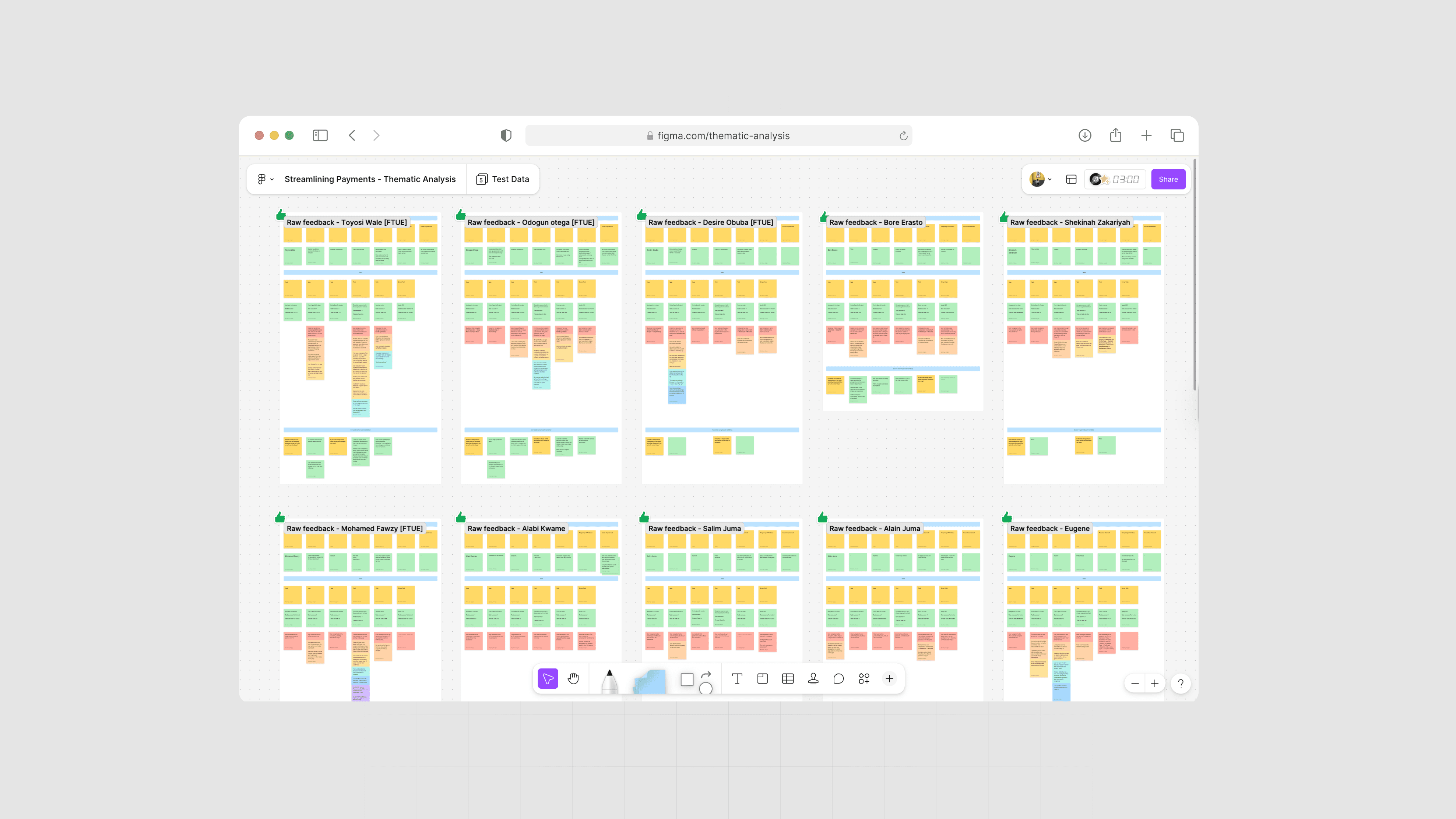
I conducted usability research with 18 participants from Nigeria, Egypt, Kenya, and Morocco who had made zero or fewer than five purchases on the Carry1st Shop within the previous four months to uncover key pain points.
I ensured regional diversity by including a 25% representation from MENA.
During moderated sessions with each participant, I measured their time-on-task, error rate, and task-completion rate across both the product and payment pages.
Time on Task
20 seconds
Error rate
44%
System Usability
64 / 100
Listening and learning
Gathering insights
I conducted usability research with 18 participants from Nigeria, Egypt, Kenya, and Morocco who had made zero or fewer than five purchases on the Carry1st Shop within the previous four months to uncover key pain points.
I ensured regional diversity by including a 25% representation from MENA.
During moderated sessions with each participant, I measured their time-on-task, error rate, and task-completion rate across both the product and payment pages.
Time on Task
20 seconds
Error rate
44%
System Usability
64 / 100
What I did next
I conducted a thematic analysis on the raw test data to highlight the trends and patterns. After completing the initial usability research, I developed high-fidelity prototypes incorporating the recommended UX improvements and conducted a second round of testing with each participant, measuring time-on-task, error-rate and task-completion rates and comparing them with the first-round results to assess measurable gains in usability.
I also administered a System Usability Survey to capture quantitative insights into the usability score before and after the improved designs were introduced.
I then partnered with the PM and engineering lead to determine the implementation priority for each design output, ensuring we addressed the most critical pain points efficiently.

Articulating design decisions
Simplifying the product and payment experience
My first objective was to simplify the product and payment experience so users can complete purchases effortlessly, with fewer steps and less mental strain
Articulating design decisions
Simplifying the product and payment experience
My first objective was to simplify the product and payment experience so users can complete purchases effortlessly, with fewer steps and less mental strain
Redefined structure and information architecture
I began by redefining the product detail page’s structure and information architecture to reduce cognitive load, highlight the most important purchasing cues, and streamline the checkout process.
Redefined structure and information architecture
I began by redefining the product detail page’s structure and information architecture to reduce cognitive load, highlight the most important purchasing cues, and streamline the checkout process.

Progressive disclosure with intuitive flow
Next, I replaced the lengthy, hard-to-scan page with a structured, progressive flow supported by strong CTAs, helping users focus on the right actions at the right time.
Progressive disclosure with intuitive flow
Next, I replaced the lengthy, hard-to-scan page with a structured, progressive flow supported by strong CTAs, helping users focus on the right actions at the right time.


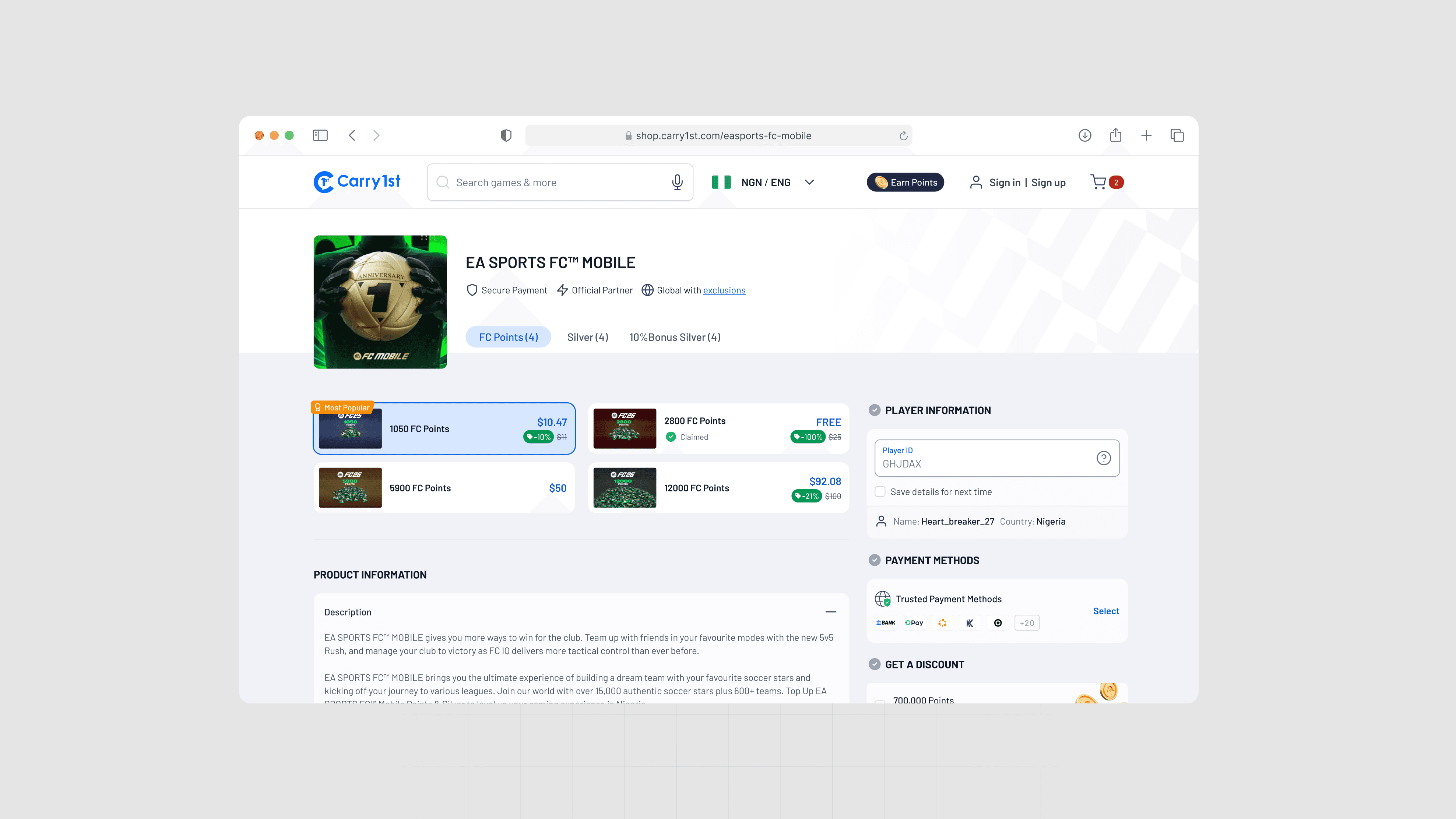
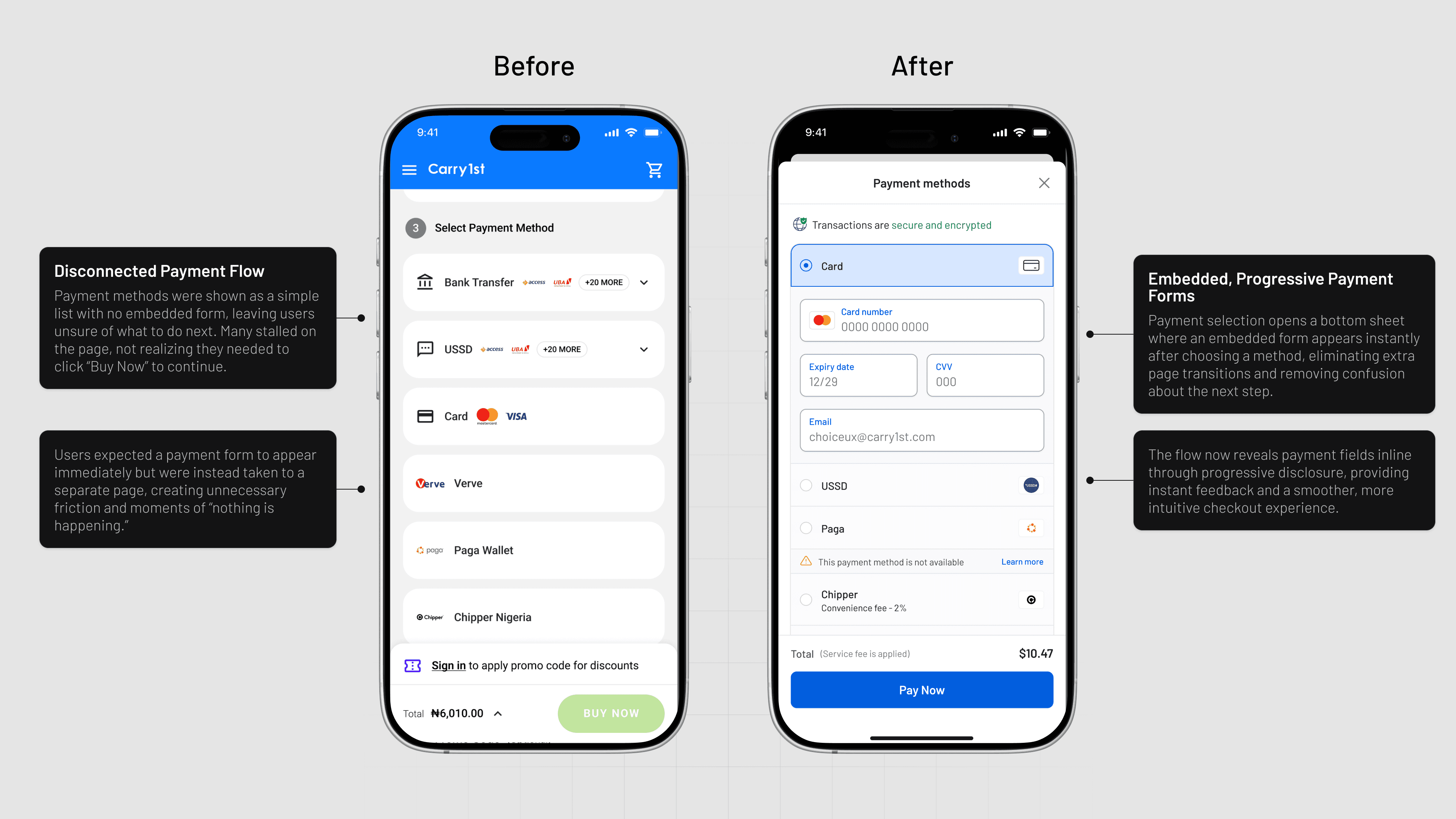
Embedded payment forms
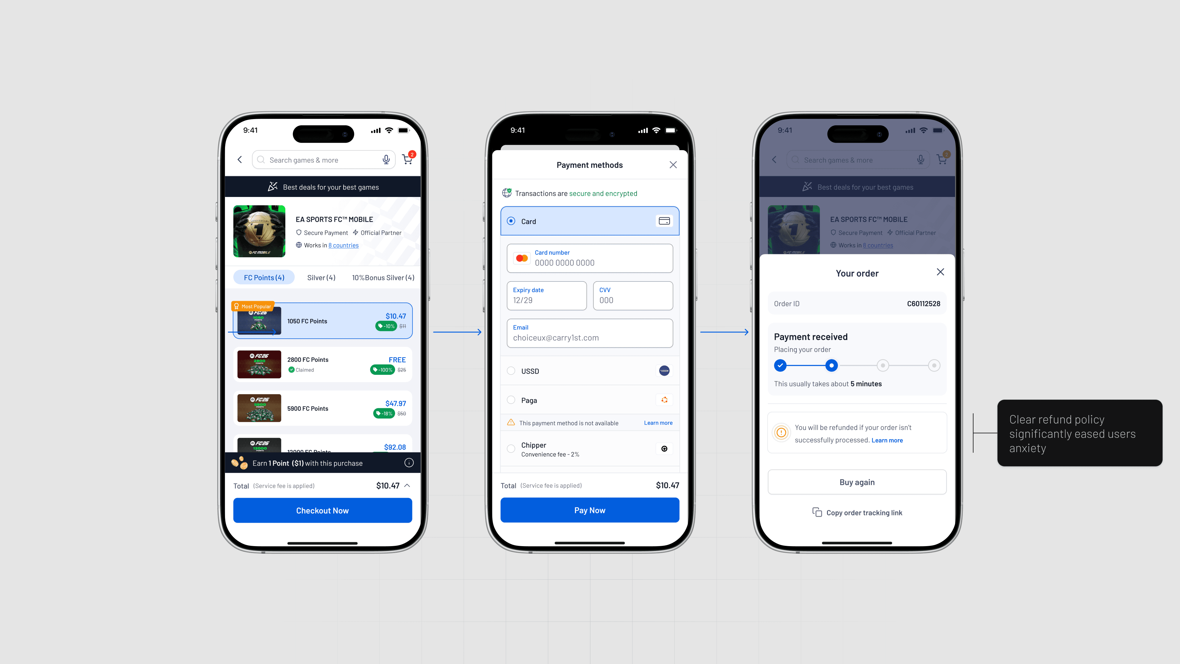
Previously, users selected a payment method but saw no form, leaving them stuck on the page and unsure how to proceed. The improved UI embeds the payment form directly after selection, guiding users seamlessly without extra clicks or navigation.
Embedded payment forms
Previously, users selected a payment method but saw no form, leaving them stuck on the page and unsure how to proceed. The improved UI embeds the payment form directly after selection, guiding users seamlessly without extra clicks or navigation.
Articulating design decisions
Building trust with trust signals
My next objective was to incorporate strong trust signals and clear reassurances at the payment step to help new and returning users feel safe, informed, and confident enough to complete their purchase.
Articulating design decisions
Building trust with trust signals
My next objective was to incorporate strong trust signals and clear reassurances at the payment step to help new and returning users feel safe, informed, and confident enough to complete their purchase.
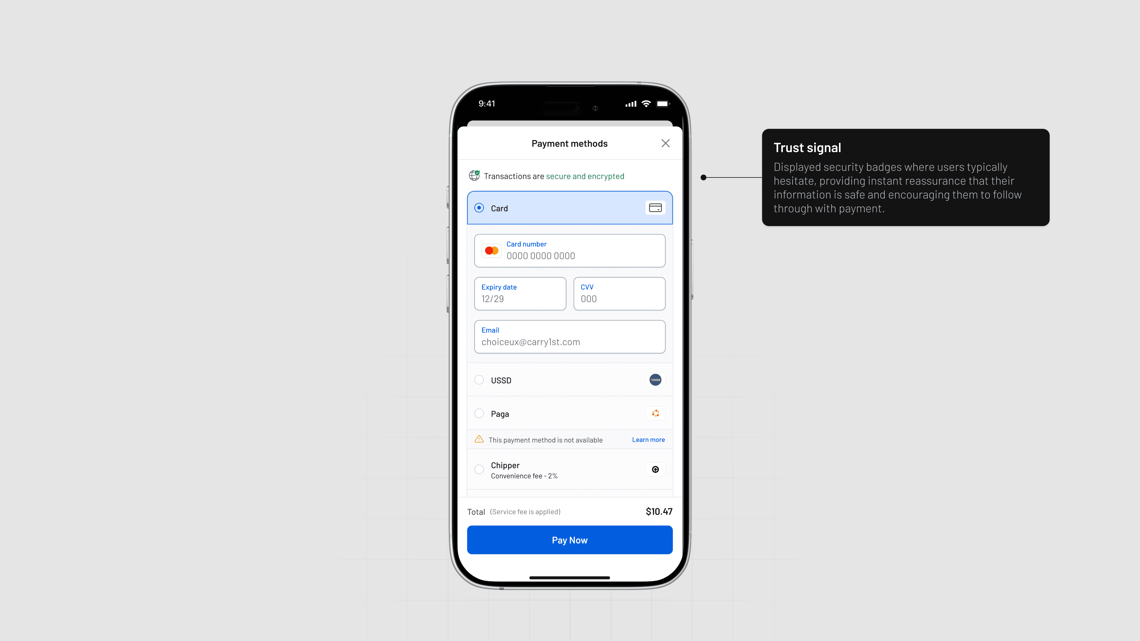
Well-placed security badges
Integrated well-positioned security indicators at key decision points to reduce anxiety, validate platform reliability, and support higher checkout conversion.
Well-placed security badges
Integrated well-positioned security indicators at key decision points to reduce anxiety, validate platform reliability, and support higher checkout conversion.

Clear Refund Policies
The experience also provides a transparent and easy-to-understand refund policy immediately after payment, reducing anxiety and helping users feel secure about resolving any issues.
Clear Refund Policies
The experience also provides a transparent and easy-to-understand refund policy immediately after payment, reducing anxiety and helping users feel secure about resolving any issues.
Articulating design decisions
Reducing frustration with better error handling
My final objective was to ensure the experience anticipates, prevents, and clearly communicates errors during checkout so users can recover instantly instead of abandoning their purchase.
Articulating design decisions
Reducing frustration with better error handling
My final objective was to ensure the experience anticipates, prevents, and clearly communicates errors during checkout so users can recover instantly instead of abandoning their purchase.
Always-active CTA
Keeping the “Checkout Now” button active and providing inline prompts or auto-scroll to any missing field to reduce confusion around form completion.
Always-active CTA
Keeping the “Checkout Now” button active and providing inline prompts or auto-scroll to any missing field to reduce confusion around form completion.


Impact on key metrics
From the outset, our UX strategy was to ensure we addressed the users' needs and positively impact the key business metrics.
Impact on key metrics
From the outset, our UX strategy was to ensure we addressed the users' needs and positively impact the key business metrics.
0%
0%
Reduction in average days to second purchase
0%
0%
Reduction in average time to complete task
0%
0%
Reduction in error during checkout
0.0
0.0
Positive System Usability Score
0%
0%
Reduction in average days to second purchase
0%
0%
Reduction in average time to complete task
0%
0%
Reduction in error during checkout
0.0
0.0
Positive System Usability Score
Collaboration & validation
The project required the collaboration of a cross-functional team, we gathered feedback as we tested iterations with users and conducted periodic grooming sessions with engineers to ensure clarity and timely release.
Collaboration & validation
The project required the collaboration of a cross-functional team, we gathered feedback as we tested iterations with users and conducted periodic grooming sessions with engineers to ensure clarity and timely release.
Helpful resources
Books
Design for How People Think

Generating Product Ideas

100 Things About People

Design for How People Think
Generating Product Ideas
100 Things About People
Course
Psychological principles
01
Progressive Disclosure - Users are less overwhelmed if they're exposed to complex features later
01
Progressive Disclosure - Users are less overwhelmed if they're exposed to complex features later
Helpful resources
Books
Design for How People Think
Generating Product Ideas
100 Things About People
Course
Psychological principles
01
Progressive Disclosure - Users are less overwhelmed if they're exposed to complex features later